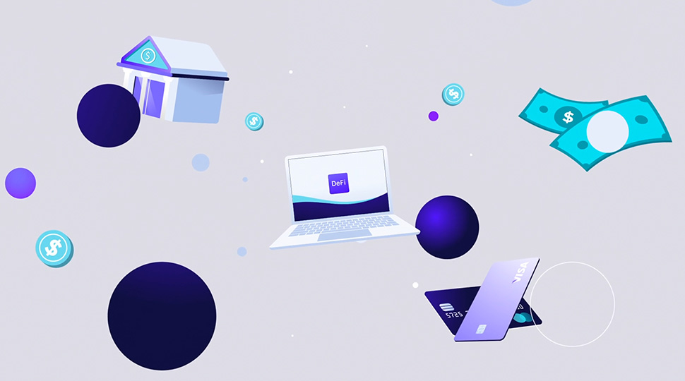
Haven’t got the time and budget to make those complex 3D animations for your marketing video? Don’t panic because 2.5D animation is there to save you.
It doesn’t take much time and has just enough creative freedom to bring your concepts to life and do everything you expect from a 3D animation. That is, to engage, to compel, and finally, to sell.
If you are fascinated by 2.5D animation, keep reading. In this article, we will explore it in detail and how it can benefit your upcoming marketing campaign.
So let’s jump in without any ado!
What is 2.5D Animation?
As the name suggests, 2.5D is an animation type that stands somewhere between traditional 2D and 3D. To create one, animators use compositing software and place 2D elements in 3D space to create the illusion of 3D animation. The camera or angle is often isometric, which adds the much-needed depth to the video.

The main advantage of 2.5D animation is that it allows you to create visually striking, complex images without needing detailed modeling or rigging techniques found in 3D animation.
The result is often referred to as “pseudo-3D” due to its realistic three-dimensional appearance but lack of actual 3D models. This pseudo-3D effect has been widely utilized in films, video games, and marketing videos, allowing you to quickly create immersive sequences with minimal effort or expense.
Its combination of traditional and modern approaches provides a great middle ground between full-blown 3D production and hand-drawn cel (frame-by-frame) animations, which perfectly suits many projects. In other words, it’s 3D on budget. 😉
What’s The Difference Between 2D, 2.5D, and 3D Animation?
By the simplest definition, 2D animation is a type of animation that takes place in a 2-dimensional space, with entities that look entirely flat to the viewer. It is produced via hand-drawn or computer-generated images arranged chronologically to give the illusion of movement.

3D animation takes the concept of animation a step further and adds more depth to it. Everything in 3D animation is rendered in a 3-dimensional space, allowing the viewer to see the objects from many angles and comparatively more detail. It’s the closest to reality.
2.5D animation stands somewhere between those mentioned above two. It combines the main characteristics of both and makes them into a hybrid animation that is actually 2D but provides the illusion of 3D. It’s all about careful shadowing, layering, and perspective adjustments of 2D objects. If executed right, it can be as good for your business as any real 3D animation and provide you the same ROI, or in some cases, even better.
Why is 2.5D Animation Getting Popular?
While there’s so much to 2.5D animation getting popular among marketers, the following are some basic features that make it more efficient and popular compared to other animation types::
1. It Explains Well & Costs Less Than 3D
Sometimes, the topic is too complex to explain, or the design you imagined cannot be achieved through plain, 2D animation. In such cases, 2.5D animation allows you enough creative freedom to turn your concept into an easy, elaborate, modern video that anyone can understand.

While this point is general to all animated videos, there are levels to it, and 2.5D is probably somewhere at the top. One of the main advantages of it is that it can look like 3D while being much more affordable than an actual 3D animation.
2. It is More Engaging
Do you know that many viewers would watch a 2.5D animation for just the sake of it? Developing engagement is half about your script and half about the visuals. That being said, since 2.5D animation is quite an out-of-the-box concept compared to traditional animation, it has the potential to get your audience fascinated through its unique visuals, resulting in overall better engagement.
3. It’s Convenient
In marketing, there are two things you cannot compromise on- the time and your budget. In fact, that’s what marketing is all about. However, unforeseen circumstances can sometimes result in postponing your projects, only to rush them later. While a pure 3D animation can cost you a lot upon hiring emergency services, 2.5D animation costs much less, with almost all the bells and whistles included. It’s way more budget-friendly and convenient.
4. Breaks Monotony
While going with the trends gives you almost guaranteed results, sometimes, going off-trends can have the same effect. Churning out the same type of animated content over and over can make your content super monotonous and, as a result, easily ignorable. Using 2.5D animation can make you stand out and increase the average views on your videos.
Where And For What Purpose Can You Use 2.5D Animation?
When we say they can break down complex topics into something simple, it doesn’t mean that these are essentially supposed to “teach” the audience something.
Their role is more of an introductory video that gets the audience to know about your product and get them excited. 2.5D videos are usually concise, with stunning visuals suited for every platform. However, they will still need a little optimization as per the demographics, as well as the watching habits of audiences.
To break it down for you, let’s talk about the video length, for example. If you are making a video for your homepage or Youtube ad, it can be as long as two minutes. However, if it’s for Facebook, you would like to keep it within the 30 seconds limit. On Instagram, it should be as short as possible, ideally 10-15 seconds, which is the maximum length of an Insta Short.
Best 2.5D Animation Examples to Check Out:
Ah! A lot of text, now let’s get to the fun stuff, and have a look at some excellent examples of animation usage to get inspired for your upcoming project:
1. Accedian
Accedian reached us to make a 2.5D animation that is visually sophisticated and resonates with their brand image without compromising on the actual message. We delivered! The resulting piece is a simple, crisp, and smooth animation that simultaneously breaks down everything Accedian is about while staying visually appealing.
While watching the video, you will notice that the overall design and color theme are super specific. This is imperative, as it helps to leave a long-lasting impact on the audience and make them recall the brand easily and for a longer time. It’s one of our finest 2.5D animation works.
2. Northwestern Mutual | Estate Planning
When it comes to animation, a little bit of abstraction always helps. This video uses it well and captures your attention from the very first second. What makes it even more compelling is the simple background throughout the video. It accentuates the animation’s main elements and keeps the audience engaged. Plus, it also helps deliver the main message effectively, which is another reason why we loved it so much.
3. Quantum Cryogenics
This animation follows the same approach as the previous one, keeping everything simple but meaningful. The animation coherently progresses with the voiceover, bringing every word and idea to life through super engaging visuals. The color theme is also pleasing, making it a fine example of how you don’t always have to go over the top to create something intriguing.
Final Thoughts
And that’s every essential thing you need to know about 2.5D animation. Now, if you are looking forward to making a marketing animation but want to stay within budget, that’s totally understandable. That’s especially true if you are in the exploration phase, looking for the perfect fit to represent your brand face.
So, if you don’t want to jump to 3D directly, we highly recommend testing with 2.5D animation and seeing how that turns out. It’s budget-friendly, has enough creative freedom, and will give you a basic idea of whether 3D is the direction you would like your marketing videos to go.
We hope our two cents on the topic have been helpful. For more informative articles, don’t forget to follow our blog. There’s a lot we need to share with you. Oh, and we also make 2.5D animation! If you feel like creating one, you can reach us here to discuss further.
Good luck!


