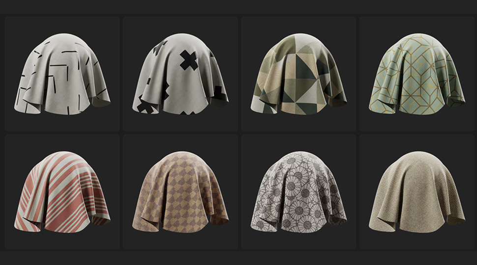
What is a Pattern?
If you walked into a room and saw two people. One in plain black trousers and another in leopard prints. Which person would grab your attention first? For me, it would be the leopard prints of course! That pattern would immediately capture my attention.
Patterns are powerful visual elements that help create consistency and unity in a design. They also give depth, life, and design with texture to an image, allowing you to grasp the attention of audiences.
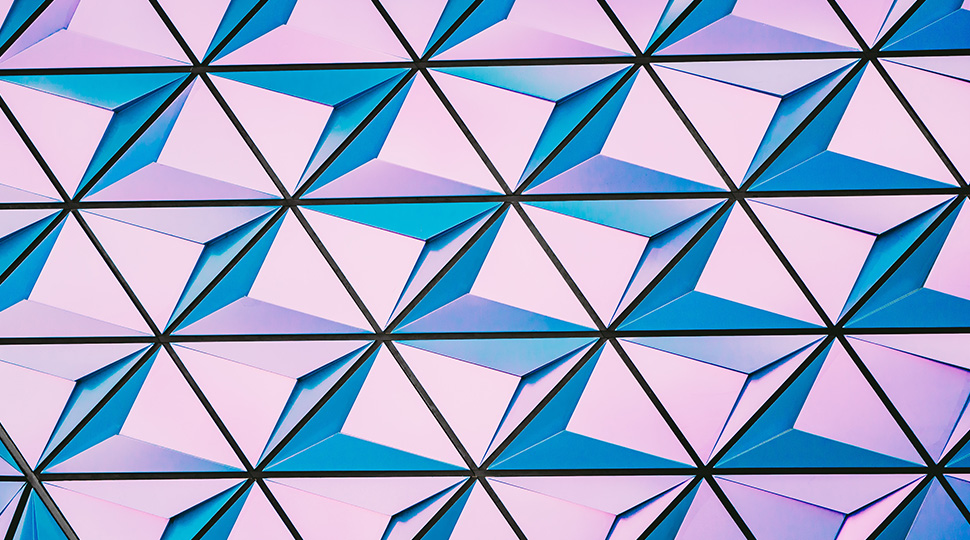
In graphic design, patterns refer to repeating elements. To become a pattern, at least two elements must work together. A design can have a pattern that covers the entire layout, emphasising continuity and repetition. Alternatively, a pattern can also appear only a few times throughout the design. It will still count as having a pattern. As long as the design elements repeat in that pattern, regardless of their size or number.
Examples of Patterns Being Used in Graphic Design
Patterns in graphic design (or motion design) enhance and add interest to a project. They vary in complexity and can be created using a variety of shapes, colours, lines and textures. What’s more, they can also communicate brand identity, express emotions or moods, and create aesthetic appeal.
The creation of patterns also requires careful consideration of colour theory. The choice of colours can have a significant impact on the overall mood and tone of a design. For example, warm colours like red and orange can evoke feelings of passion and excitement, while cool colours like blue and green can convey calmness and serenity.
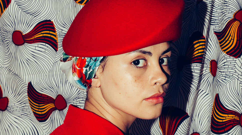
In addition to colour, the use of lines and textures can also play a vital role in pattern design. Different line weights and textures can help create depth and contrast, making the pattern more visually interesting. Combining different patterns, such as stripes and polka dots, can also create a unique and eclectic look.
Let’s look at some examples of how patterns are being used in different contexts:
Packaging
By using simple shapes and complex patterns, you’ll realize you can easily make a design pop.
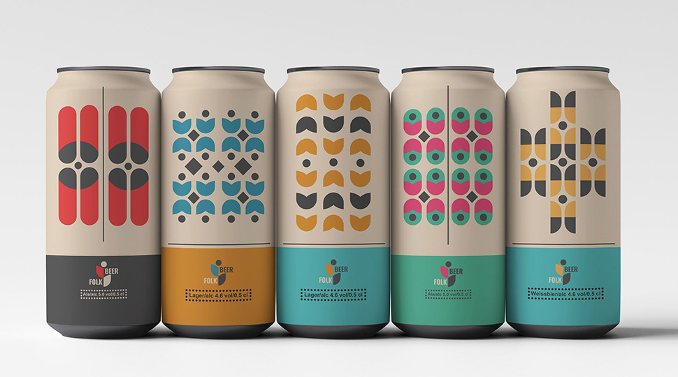
When it comes to creating designs that catch the eye, the use of simple shapes and complex patterns can be very effective. Simple shapes, such as circles, squares, and triangles, can be combined and arranged in unique ways to create interesting compositions. Adding complex patterns to these shapes can make them even more dynamic and visually appealing.
For instance, using geometric patterns or abstract designs can help create a modern and sophisticated look. Similarly, incorporating organic patterns, such as floral or foliage designs, can add a sense of natural beauty to a design.
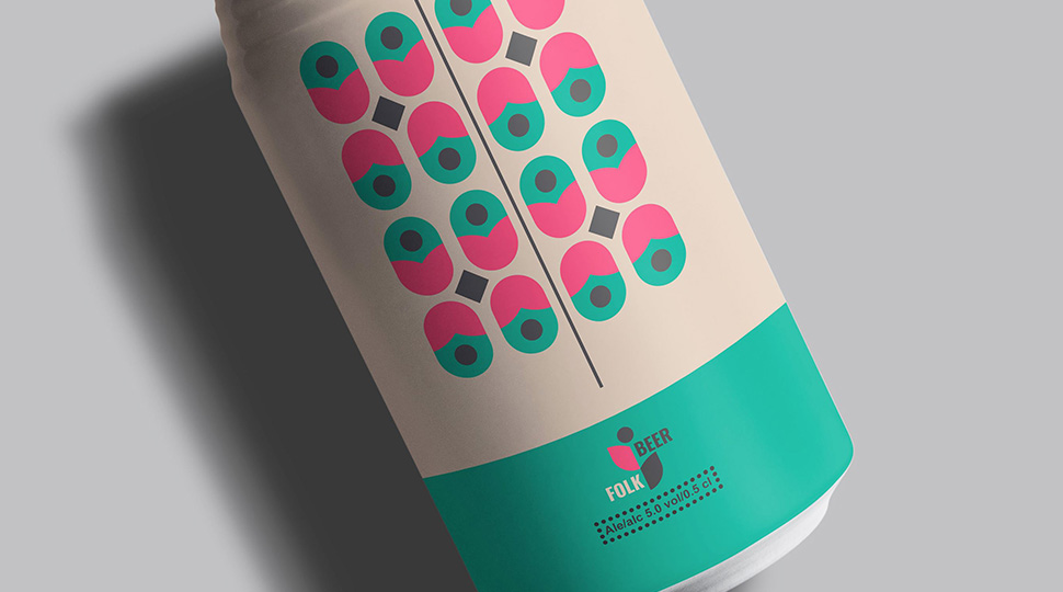
Graphic designer, Taras L loves incorporating different patterns into his designs. Here’s one example of his work with a German beer company called “Folk Beer”.
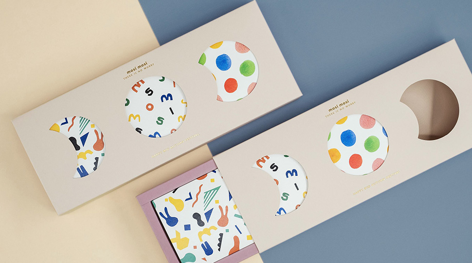
Another example is by high-functioning autism illustrator and graphic designer Mike Ng. His ability to think outside of the box and at the same time give a human touch to his designs is inspiring. Here’s his work with “Mosi Mosi” on their mooncake packaging.
Brand Identity
Designing a brand identity using patterns can effectively combine consistency, appeal, and messaging to produce captivating visual identities.
When designing a brand identity using patterns, it’s essential to ensure that the patterns are aligned with the company’s values and mission. Patterns can be used to communicate the company’s personality, vision, and values. For instance, a company that values innovation and creativity may choose to use abstract and unconventional patterns in its branding.
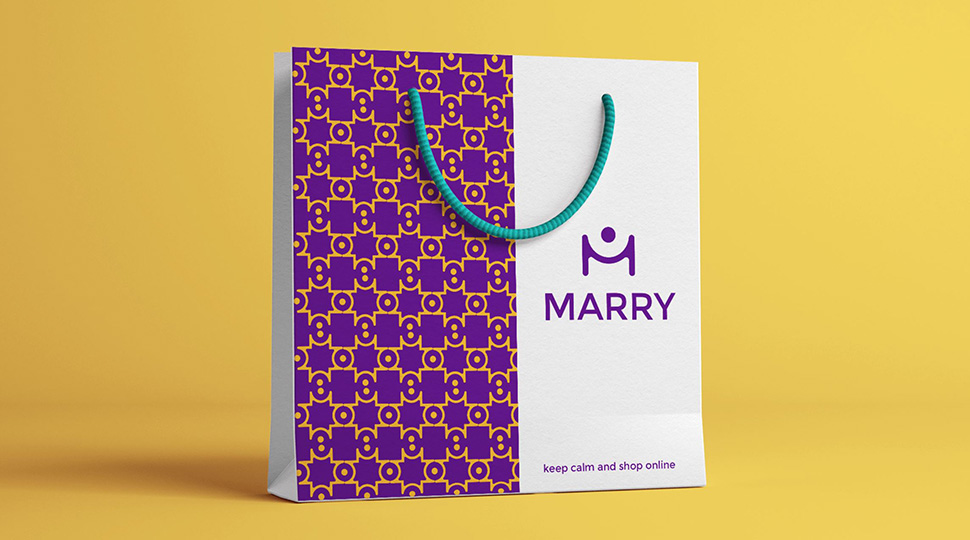
Graphic designer Ahmed Ibrahim’s brand identity for the fashion company “Marry” shows how patterns can add both visual appeal and class.
Typography
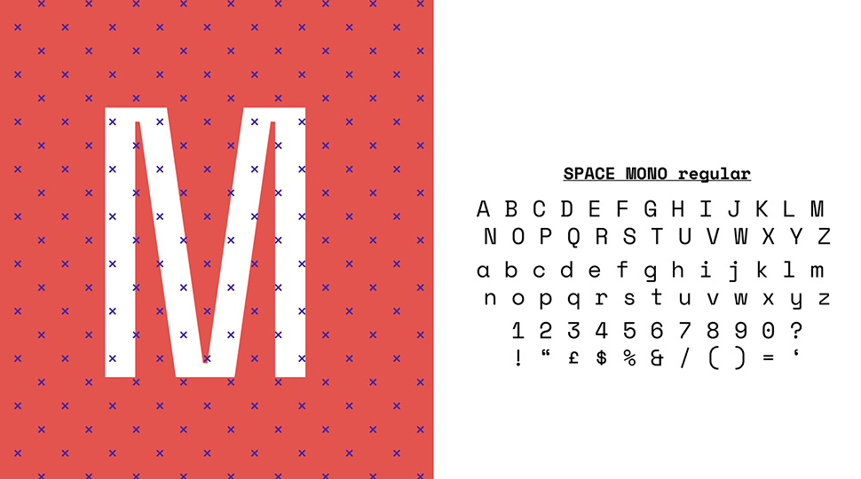
Mainstream fonts are boring. Why not take it up a notch by adding patterns to your fonts? It will most definitely attract attention and express a visual narrative genuinely. There are just so many exciting ways for you to incorporate patterns into typography.
Now that you’ve seen some examples of how patterns are being used in graphic design, it’s time for you to give patterns a shot.
Need websites to get high-quality patterns for your project? Here you go:
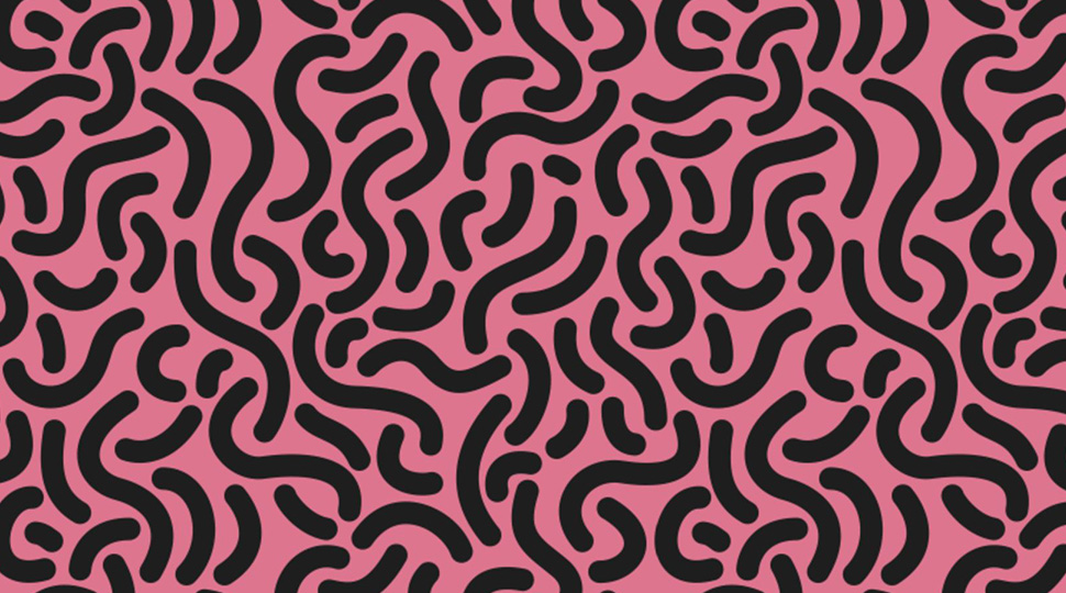
1) Dinpattern
Evan Eckard, a web, UX and graphic designer has provided an ever-growing library of unique patterns for designers. Everything offered on Dinpattern is free to use for both commercial and non-commercial purposes on the web and screen.
2) Vecteezy
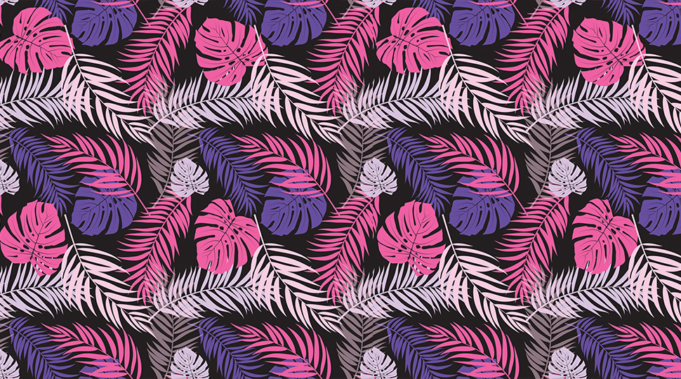
Vecteezy provides a range of resources for creatives including textures. Their unique textures do come at a cost for some whilst others are free. It is important to check the licence and usage rights for each product before downloading.
3) Alexander’s Paper Textures & Patterns
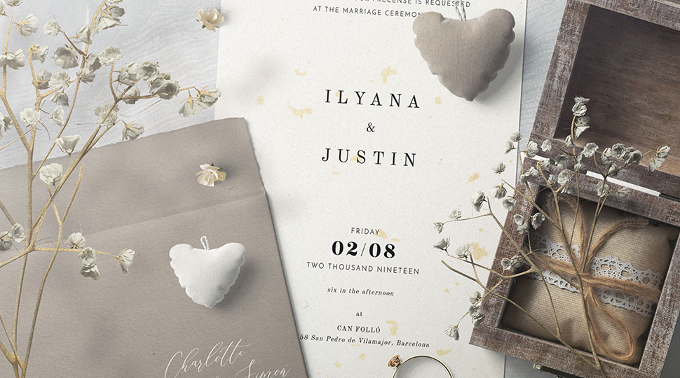
This free pack by designer Alexander Nedviga includes 72 decorative paper textures. This carefully curated extensive collection allows you to apply it to any creative work. You may also check out his profile for other texture packs available.
4) The Pattern Library
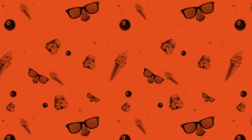
A project by designers Tim Holman and Claudio Guglieri, The Pattern Library has a range of fairly unique pattern designs that are free.
5) Poliigon
This amazing site seems to have an extensive (and premium) library of resources. There’s no surprise that patterns are also on that list. Some of their patterns are free whilst others come at a cost. But with Poliigon, you know the quality won’t be compromised.
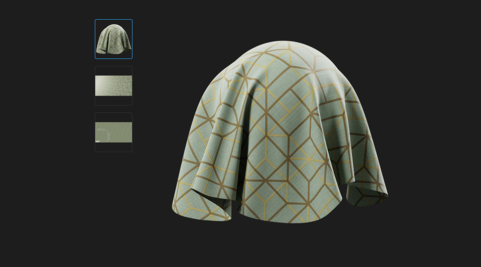
6) Ava7Patterns
Ava7Patterns has a range of free seamless patterns for you to play around with. However, everything is only available for personal use.
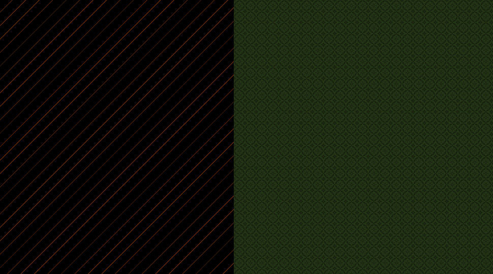
7) PatternCooler
PatternCooler is a fun one because it allows free experimentation with colours, sizes, and patterns on the site itself. The user interface might not be perfect but I’m sure you’ll be fine once you get the hang of it.
8) Architextures
Developed by architect Ryan Canning, Architextures has a variety of patterns for you to try out. It’s free for personal and educational purposes. However, for commercial use, users need to purchase a Pro account, which provides access to high-resolution resources and extra features.
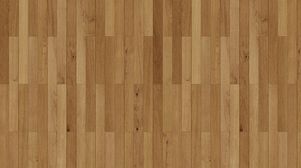
9) Unsplash
You probably have heard about this free stock image site. But what you might not know is that they also provide a great library of patterns. With creators from around the world showcasing their work on Unsplash, you get a wide variety of different patterns to choose from.
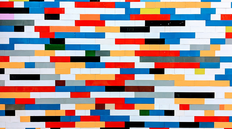
10) Sab’s Pattern Pack
Designer Sab introduced his first tileable texture pattern set. All CC licensed, each pattern is carefully and uniquely designed and free for download.
Final Thoughts
Patterns are powerful tools that can elevate your graphic designs. It just gives a simple design more character. Like how if Darth Vader rocked up in a polka dot suit, he would immediately look less intimidating😂.
Hopefully, the patterns you see in this article inspire you to go forth and create something amazing.


