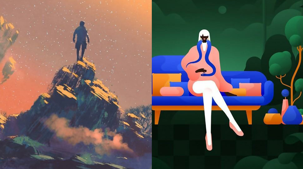
They say creativity is intelligence having fun. Well, going by some of the illustrations we have seen this year, we reckon that may just be the case! Digital artists have proven that they can keep pushing the limits of their imagination and continue to astound the eye of the beholders everywhere.
New styles and trends are being constantly introduced by today’s artists. We take a look at some of the freshest and coolest illustration trends that we have seen this year. From super-real landscapes to tech concepts with a touch of vintage, these illustration trends have given us a lot of food for thought.
Let us begin.
Gradients are here to stay
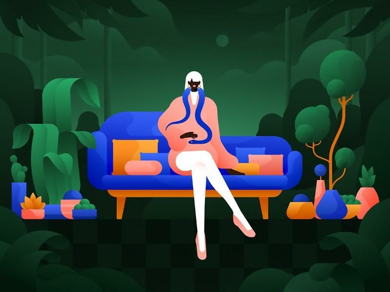
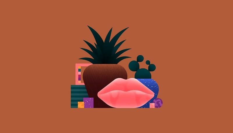
We have seen gradients coming back in a big way for illustrations in the past year or so. And judging by how sleekly they are employed by illustrators, this trend is here to stay.
If you work with flat design, gradients can help you add depth to your illustration easily. Here are some examples of gradients being employed to great effect by Justina Lei, a Copenhagen-based illustrator.
Open Compositions
Today’s designers want to embrace open spaces in a big way, and they are doing exactly that with open compositions. These are designs that give you the feeling that you may be seeing part of the whole picture, but as you take a second look, there’s a whole new world out there.
Open compositions are about eschewing hierarchy and leaving something to the imagination. They embrace white space and include elements that make you feel that it’s all connected to each other. At first glance, these designs might seem chaotic and random, but observe them and you can’t help but feel there’s a method to this madness.
An example of open composition illustration (Via Bruno Pego)
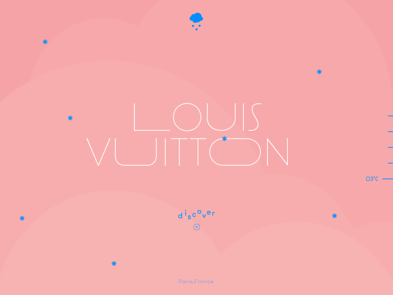
This illustration makes you feel like some of the action is continuing off-screen as open composition does. (via Lionel Durimel)
Isometric Design continues to rock
As we show with open composition, some things are better left out to a viewer’s imagination. Now isometric design does something diametrically different, with the artist weaving a whole new universe in front of your eyes. Isometric design involves drawing 3D objects, but in two dimensions. It features a lot of depth when compared to flat design.
You might have seen examples of isometric designs already, seeing as how icon designers are in love with it. This is because isometric icons look warm and tactile than those made via flat design. They just reel users in.
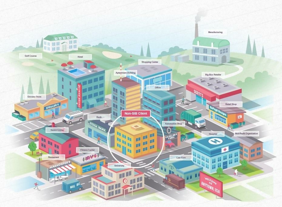
An isometric design of a city (via LittleFox)
Art Deco
After the first World War, artists of the world gave birth to what is known as the “modern” design era. This era of modern art design continued for half a century, giving birth to a plethora of styles that were glamorous, ornamental and streamlined. Today, two of the most prominent styles from the post WWI era are enjoying resurgence:
- The Art Deco style from the 1920s
- The organically streamlined modern design from 1950s and 60s.
And now here we are, almost a century later, with Art Deco-inspired designs enjoying a renaissance in 2019. This trend is prevalent particularly in logo work today. We are seeing today’s designers weaving the intricate line-work that is a feature of Art Deco style in their work, while mixing it up with sharp metallic aesthetic.

This logo is glamorous and modern. A piece inspired by the Art Deco period of the 1920s. (via Arthean)
It’s not just logos that are getting the Art Deco treatment. Even typography is fair game here. Sans-serifs are getting leggy and narrow than before, a trend that was a feature in the classic posters of yesterday.
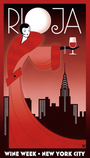
The Art Deco Style by Robin Howlett
Art Deco-inspired designs give you a luxurious and grand look, a far cry from the rustic artwork that we have been seeing for the past few years. It seems like opulence is in and country-inspired artwork is out.
Get Real with Hyper-real Landscapes
Up till now, you’ve seen vintage, art deco and modern illustration trends that you’ve been familiar with in one capacity or another. This time we’re going for something radically different – hyper-real landscapes.
Just one look at this wildly elaborate illustration trend will have you in awe at the style and quality of these futuristic artworks. Hyper-real landscape illustrations marry a lot of elements from fantasy worlds and sci-fi culture.
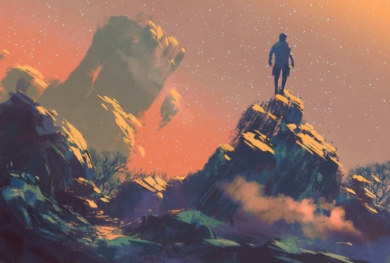
Real or alien? An example of a hyper-real landscape illustration (via grandfailure)
The phenomenal details of craftsmanship in these illustrations will have you explore every nook and cranny of it. It engrosses you and transports you to another world, figuratively.
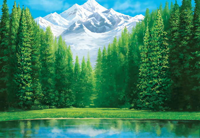
So real to mistaken this for something out of our own world. (via Grant Reed)
Expect hyper-real landscape illustrations to dominate social media this year and the next.
What’s next?
2019 was a revelation with these new illustration trends dominating the headlines. The diverse and broad art styles on display ensure that there is something for everyone. Be it the retro-infused stylings in art deco trend, or the modernist nature of isometric illustrations, we were left impressed.
We don’t know about you, but we’ve noticed that most of the artwork from 2019 is shifting towards delivering a message about the social issues of today. We see the role of technology touching everyday aspects of our lives, especially social media. We see imaginative mystery worlds that belong in a sci-fi epic that we wish we could escape to.
These artists have given us a lot of inspiration with their fresh takes on illustration and the next year promises to be even better. As for new trends coming out next year, be sure to keep an eye on on 3D realism. Not only will we get to see more spectacular and creative 3D designs than ever before, but we will also get to see how artists use it with photos, 2D objects and more. The gaps between what’s real and virtual continues to shrink, all thanks to always-evolving digital illustration styles. Keep an eye out on their work, we have a feeling the best is yet to come.


