Design and marketing have always been two concepts that go hand-in-hand, but now more than ever, the power of illustration is blooming.
Between the sleek motion graphics on every webpage to the charming 2D characters bouncing around in explainer videos, there’s illustration everywhere. And if you’re an artist yourself trying to keep up with the hottest styles, you’ll want to read on.
Here are the top 10 trending illustration styles to really grab attention in 2023!
1) Retro
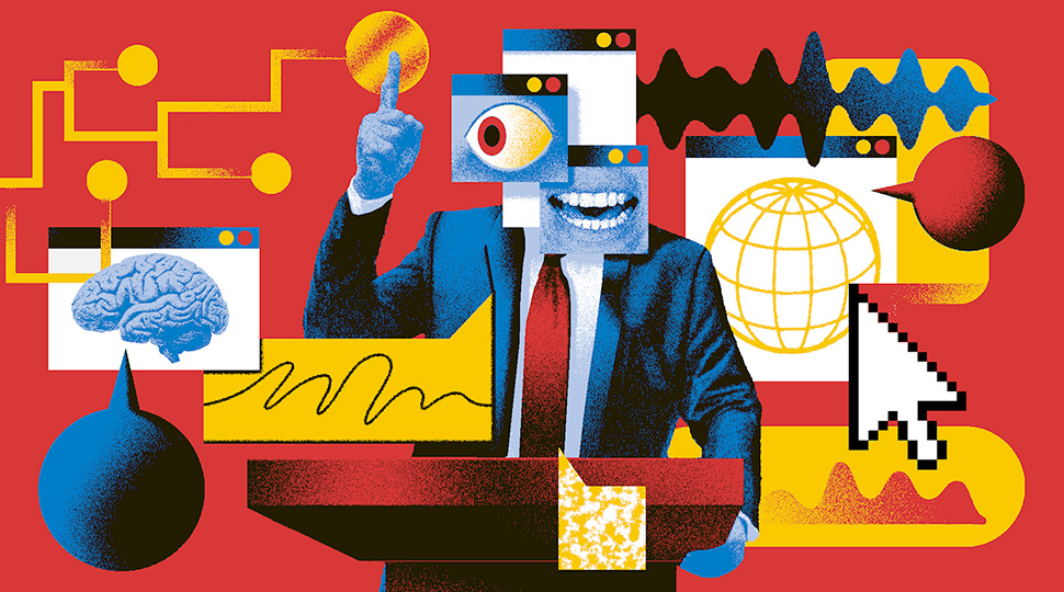
With nostalgia coming in force upon us, throwbacks to old design trends are at the peak of popularity. This style is all about taking a step back in time, leveraging styles, colours, and techniques that were popular in the past.
Credit: Tomasz Woźniakowski
Key features usually include a limited colour palette as well as bold lines and shapes that evoke that retro vibe. Whether it’s that old-school charm, the draw of nostalgia, or just the bright tones, retro illustrations can sprinkle life into any piece.
2) Isometric

Want the detail of 3D with the simplicity of 2D? Why not try 2.5D? Also known as isometric design, this particular style has been red hot for years, and it’s not hard to see why. With the 3D feel that this style adds, you get the depth without the complexity of a full 3D render.
This touch of dimensionality lends an artistic and professional touch to how objects and spaces are depicted and is especially well-suited for technical illustrations and architectural drawings.
3) Flat illustrations
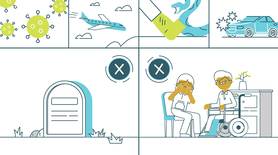
You can’t go wrong with a classic. Flat illustrations lend a nice, uncomplicated charm to any poster or animation they’re used in. This is a style that leans heavily on simplicity, using straightforward shapes to create images that are easy on the eyes and quick to understand.

Think of it as a “no-frills” approach to illustration that’s all about letting the basic elements shine. This style is massively popular in digital design, providing visuals that are modern and easy to digest and pair perfectly with contemporary design.
4) Minimalism
Sometimes less is more, and there’s no style that proves that more than minimalism. With this style, you’ll be stripping down the artwork to its most essential elements, ditching the details and focusing only on what’s necessary, with the simplicity urging the viewer to fill in the gaps with their own interpretations.
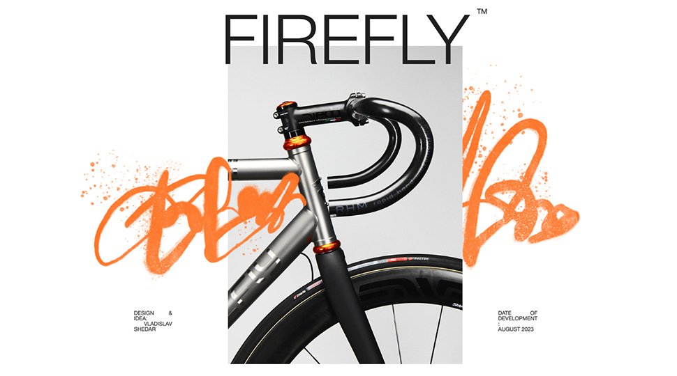
Every line and colour used is deliberate and calculated. The beauty of this style lies in its restraint, offering a serene and calming visual experience that invites viewers to explore the depths of simplicity. It’s eloquent and adds a professional feel to any artwork.
5) Doodle
Things can get boring if they’re too clean, so shake it up with the perfect imperfect style — doodles! Characterized by their spontaneous and unrestrained nature, it’s a style that doesn’t take itself too seriously.
Allowing for whimsical and imaginative creations that feel personal and hand-crafted, these artworks are vibrant, playful, and often infused with a sense of humour. Doodle-style illustrations (especially vector based) offer a joyful and light-hearted visual experience that can evoke a child-like sense of wonder and delight.
6) Risograph
A mix of that nostalgic feel with the flecks of imperfection brings the Risograph style. Mimicking the Risograph-printed art of the past, these illustrations lean into a vibrant yet limited colour palette and often feature a grainy texture.
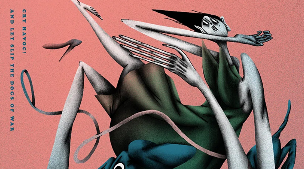
Credit: Andrew Tseng
This style is a nod to the retro printing technology of Risographs, showcasing an affinity for bold, overlapping colours that can create unexpected and delightful new hues and textures. It brings a tactile and organic feel to the visual experience that speaks to both nostalgia and innovation. It’s all about embracing the imperfect, the grainy, and the vibrant, giving works a kind of retro warmth that feels both familiar and fresh.
7) Holographic
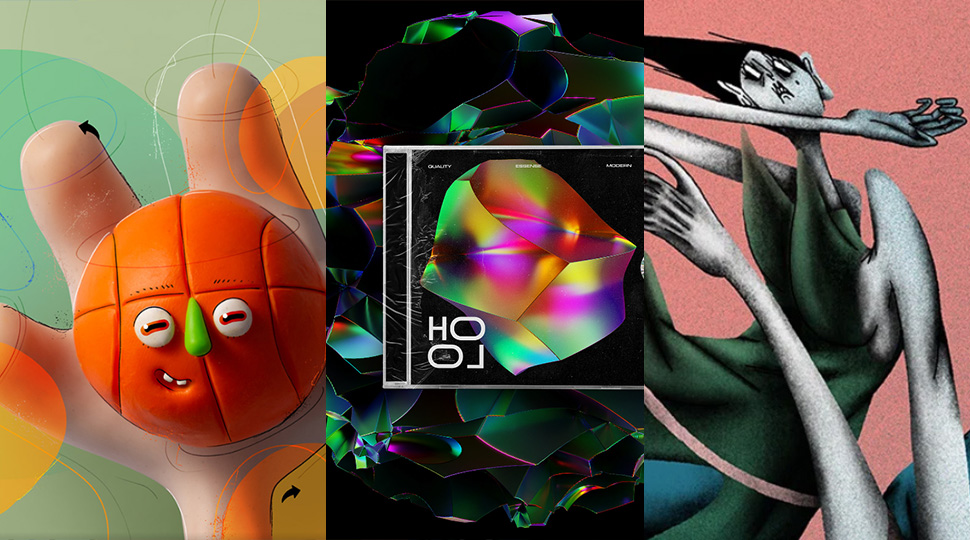
With the Y2K revival, the silver cyber aesthetic is everywhere, and the holographic style is the perfect way to join in. Drawing inspiration from the shimmering, multi-colored, and reflective properties of holograms, these use iridescent colours and gradients to create a futuristic vibe.
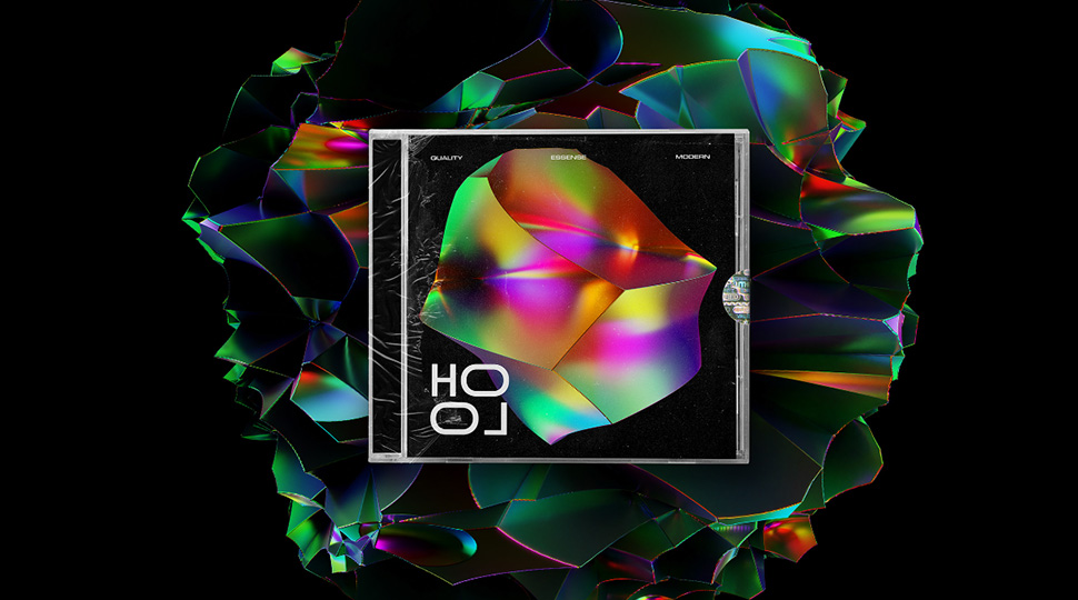
Credit: DesignesSense
It offers a kind of intrigue that’s dynamic and ever-changing, offering a mesmerizing and almost hypnotic visual experience. It’s a fresh, modern approach that can turn an illustration into a vibrant and dynamic visual experience.
8) Clay
If you want to add a playful, tactile factor to your illustration, clay is the way. Clay-style illustrations emulate the look and feel of clay sculptures, bringing a tactile, three-dimensional quality.
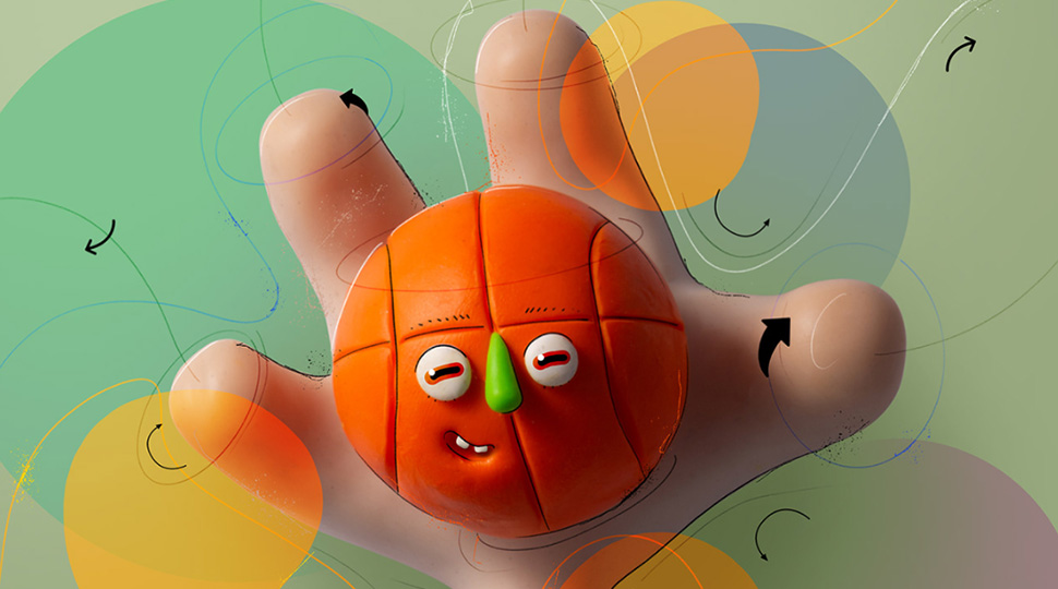
Credit: Larissa Honsek
Picture illustrations with a playful and organic appearance, where forms have a rounded, soft, and almost touchable element that invites you to reach out and touch it. It evokes a sense of nostalgia and the joy of creation, offering a fresh take with a tactile appeal.
9) Geometric
Clean, yet no less intricate, geometric illustrations can add a sleek flair to any design. This style makes use of geometric shapes. Think circles, squares, triangles and other angular elements to create stylized modern imagery.
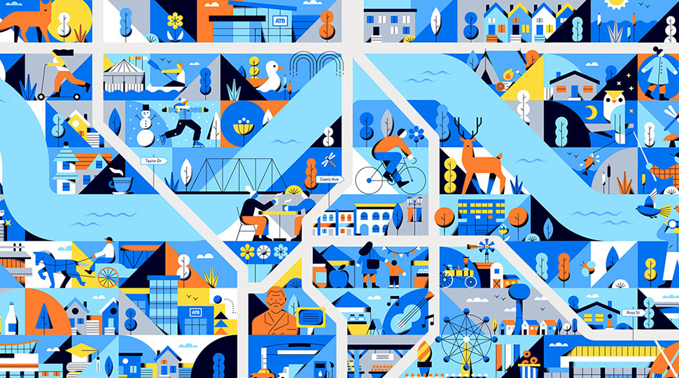
Credit: Ray Dak Lam
These are visuals that celebrate symmetry, balance, and proportion. It’s a go-to style when aiming to convey complex ideas with clarity and simplicity, presenting a modern, distinct, and often futuristic aesthetic.
10) Abstract
Abstract illustrations are great for giving a creative spin on any project. With this style, you’re essentially playing with shapes, colours, and lines with no strict adherence to recognizable objects or scenes. You get the freedom to express emotions or ideas without being tied down to reality.
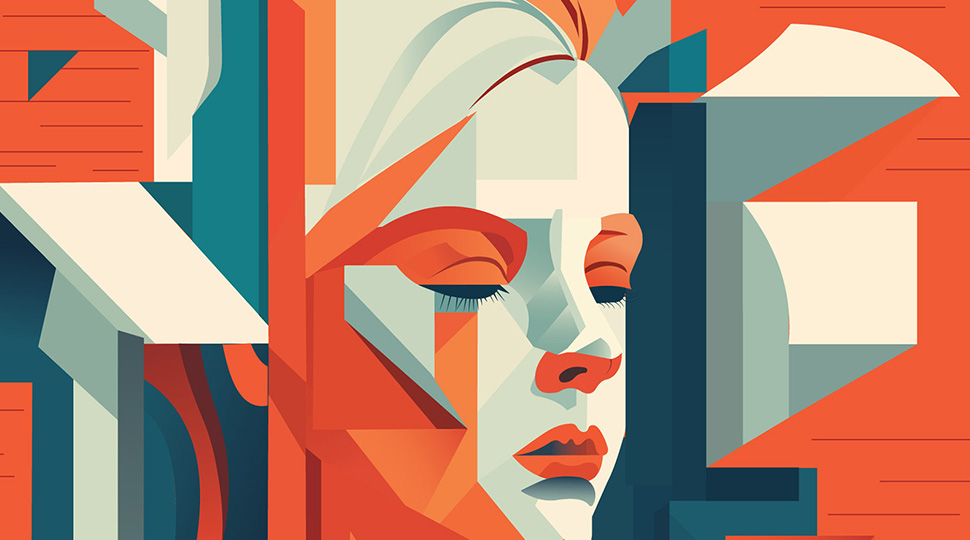
This kind of art can resonate deeply with viewers, offering them a more personal connection to the artwork through interpretation. This approach works particularly well with more emotional topics, adding an extra dimension that would have been lost with a straightforward approach.
Wrapping Up
There’s no shortage of variety when it comes to artful illustrations and no inherent advantage of one style over another. Each style has its strengths and is better suited for different purposes, such as how isometric styles best display technical knowledge or how abstract art better expresses emotions. With any of the styles we’ve written about here, you can guarantee that your art will stand out.
Do You Need A Trendy Illustration For Your Business?
Dive into a world where trend meets artistry. With over a decade of award-winning illustrations and animations under our belt, we’re here to craft your vision. Contact our team at: KasraDesign.com/Get-A-Quote


